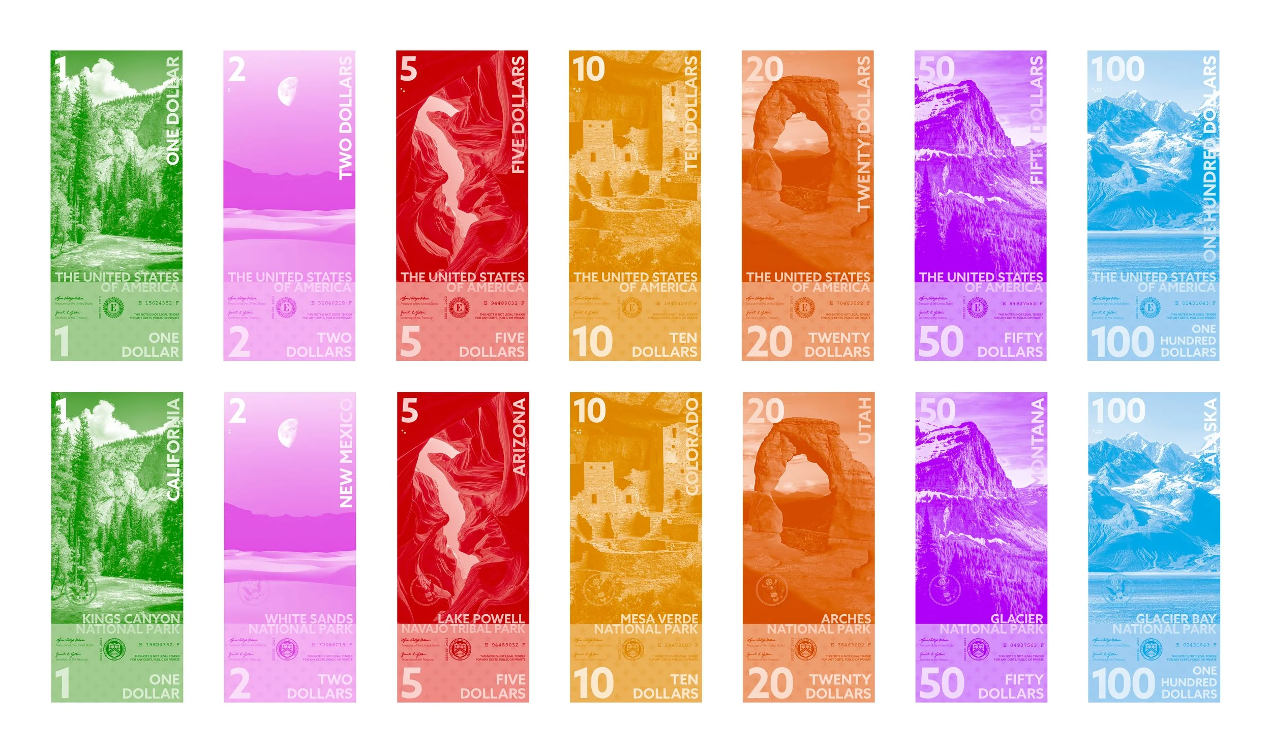
U.S. Currency Redesign
This re-design of US Currency aimed to modernize the visuals of our paper money and give it more of a sense of national pride than the current system. Using photography of National Parks avoids any controvercy surrounding figures that may have been placed on the bills, and beautiful photos of natural landscapes create much more visual interest than former presidents. The monochromatic designs used on the bills were chosen to ease the cost of mass printing. The bills also include many features designed to make them more accessible, as well as more convient for users. The bills feature braille in the upper left, below the number. The vertical design on the lower third of the bills was designed to be legible while tucked away in a cash register. Bright, distinct colors for each denomination of bill makes them instanly distinguishable from one another, eliminating the need for pulling the bills out to check the face values when searching through a wallet.


